Card
The Card component is a flexible container inspired by MUI Joy, with built‑in variants, colors, sizes, orientations, and named subcomponents.
Demo
A clean white surface with light shadow and media cover.
Usage
- TypeScript
- JavaScript
import React from "react";
import {
  Card,
  CardContent,
  CardActions,
  CardCover,
  CardOverflow,
  RatioBox,
  Button,
  Box,
} from "@libdev-ui/base";

export default function Example() {
  return (
    <Card sl={{ bgcolor: "white", color: "#111", borderRadius: "lg", boxShadow: "sm", width: 320 }}>
      <CardCover>
        <RatioBox ratio="16/9">
          <img
            src="/img/3_fb99f3009da5dcf1503b52e5e417cf4f.jpg"
            alt="Cover"
            style={{ width: "100%", height: "100%", objectFit: "cover" }}
          />
        </RatioBox>
      </CardCover>
      <CardContent>
        <strong>Example Card</strong>
        <p style={{ margin: 0 }}>A clean white surface with light shadow and media cover.</p>
      </CardContent>
      <CardActions>
        <Button variant="filled" color="primary">Learn more</Button>
        <Button variant="outlined" color="secondary" sl={{ ml: 1 }}>Cancel</Button>
      </CardActions>
    </Card>
  );
}
import React from "react";
import {
  Card,
  CardContent,
  CardActions,
  CardCover,
  CardOverflow,
  Button,
  Box,
  RatioBox,
} from "@libdev-ui/base";

export default function Example() {
  return (
    <Card sl={{ bgcolor: "white", color: "#111", borderRadius: "lg", boxShadow: "sm", width: 320 }}>
      <CardCover>
        <RatioBox ratio="16/9">
          <img
            src="/img/3_fb99f3009da5dcf1503b52e5e417cf4f.jpg"
            alt="Cover"
            style={{ width: "100%", height: "100%", objectFit: "cover" }}
          />
        </RatioBox>
      </CardCover>
      <CardContent>
        <strong>Example Card</strong>
        <p style={{ margin: 0 }}>A clean white surface with light shadow and media cover.</p>
      </CardContent>
      <CardActions>
        <Button variant="filled" color="primary">Learn more</Button>
        <Button variant="outlined" color="secondary" sl={{ ml: 1 }}>Cancel</Button>
      </CardActions>
    </Card>
  );
}
More examples
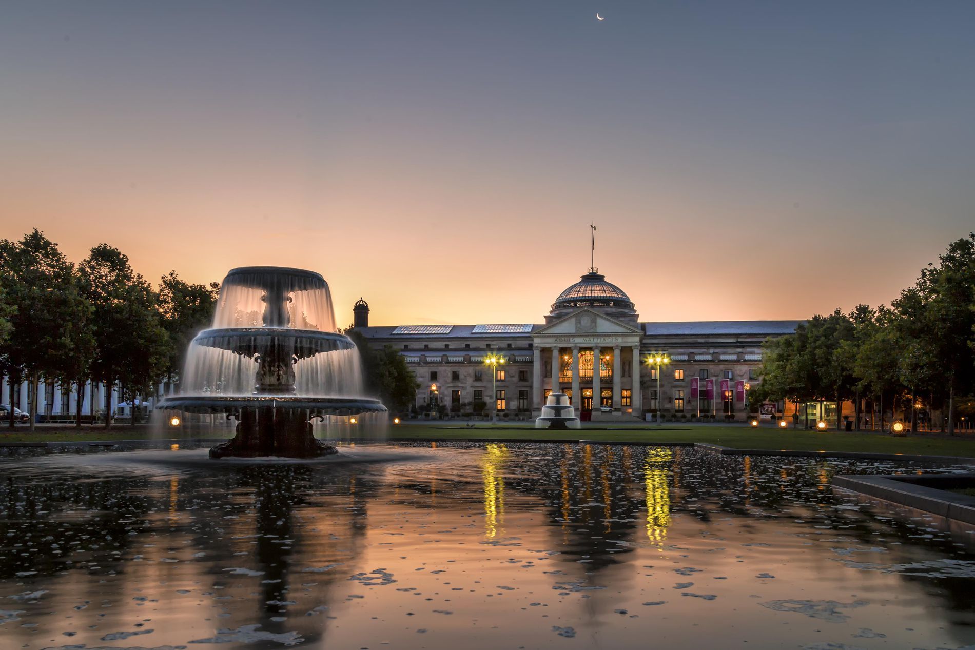
Top cover with RatioBox (16:9)
City skyline
Soft evening light and long exposure motion.
- TypeScript
- JavaScript
<Card sl={{ bgcolor: "white", color: "#111", borderRadius: "lg", boxShadow: "sm", width: 360 }}>
  <CardCover>
    <RatioBox ratio="16/9">
      <img src="https://picsum.photos/seed/card-169/800/450" alt="City skyline" />
    </RatioBox>
  </CardCover>
  <CardContent>
    <h3 style={{ margin: "0 0 6px 0" }}>City skyline</h3>
    <p style={{ margin: 0, color: "#555" }}>Soft evening light and long exposure motion.</p>
  </CardContent>
  <CardActions>
    <Button variant="filled" color="primary">Open</Button>
    <Button variant="ghost" color="secondary">Share</Button>
  </CardActions>
</Card>
Horizontal card (media left, 1:1)
City
Lorem ipsum dolor sit amet, consectetur adipiscing elit, sed do eiusmod tempor incididunt ut labore et dolore magna aliqua. Ut enim ad minim veniam, quis nostrud exercitation ullamco laboris nisi ut aliquip ex ea commodo consequat.
- TypeScript
- JavaScript
<Card
orientation="horizontal"
  sl={{
    display: "grid",
    gridTemplateColumns: "300px 1fr",
    alignItems: "stretch",
    gap: 6,
    bgcolor: "white",
    color: "#111",
    borderRadius: "lg",
    boxShadow: "sm",
  }}
>
  <CardCover sl={{ width: "100%" }}>
    <RatioBox ratio="1">
      <img src="/img/3_fb99f3009da5dcf1503b52e5e417cf4f.jpg" alt="City" />
    </RatioBox>
  </CardCover>
  <Box sl={{ display: "flex", flexDirection: "column", minWidth: 0 }}>
    <CardContent>
      <Text level="h3" style={{ margin: "0 0 6px 0" }}>City</Text>
      <Text style={{ margin: 0, color: "#555" }}>
      Lorem ipsum dolor sit amet, consectetur adipiscing elit, sed do eiusmod tempor incididunt ut labore et dolore magna aliqua. Ut enim ad minim veniam, quis nostrud exercitation ullamco laboris nisi ut aliquip ex ea commodo consequat.
      </Text>
    </CardContent>
    <CardActions
      orientation="horizontal"
      sl={{ mt: "auto", justifyContent: "flex-end", gap: 2 }}
    >
      <Button variant="filled" color="primary">Book</Button>
      <Button variant="outlined" color="secondary">Preview</Button>
    </CardActions>
  </Box>
</Card>
Blog card with header/footer overflows
Editorial
Design systems that scale
A practical look at tokens, themes, and component APIs.
- TypeScript
- JavaScript
<Card sl={{ bgcolor: "white", color: "#111", borderRadius: "lg", boxShadow: "sm", width: 420 }}>
  <CardOverflow variant="plain" color="secondary" size="sm" sl={{ p: 2 }}>
    <span style={{ fontSize: 12, textTransform: "uppercase", letterSpacing: 0.4 }}>
      Editorial
    </span>
  </CardOverflow>
  <CardCover>
    <RatioBox ratio="16/9">
      <img src="https://picsum.photos/seed/card-blog/900/506" alt="Design systems" />
    </RatioBox>
  </CardCover>
  <CardContent>
    <h3 style={{ margin: "0 0 6px 0" }}>Design systems that scale</h3>
    <p style={{ margin: 0, color: "#555" }}>A practical look at tokens, themes, and component APIs.</p>
  </CardContent>
  <CardOverflow variant="outlined" color="secondary" size="sm" sl={{ p: 2 }}>
    <div style={{ fontSize: 12, color: "#666" }}>8 min read · 2 days ago</div>
  </CardOverflow>
</Card>
Props
Card
A container with optional media cover, content, actions, and overflow sections. Use sl to set the white surface by default in light UIs.
| Name | Type | Default | Description |
|---|---|---|---|
children | React.ReactNode | — | Content of the card. |
color | 'neutral' | 'primary' | 'secondary' | 'success' | 'danger' | 'warning' | 'info' | string | 'neutral' | Card color; accepts theme tokens and custom strings (#hex, named colors, var(...)). |
variant | 'outlined' | 'plain' | 'soft' | 'solid' | 'outlined' | Visual variant. |
size | 'sm' | 'md' | 'lg' | 'md' | Controls internal spacing and density. |
orientation | 'vertical' | 'horizontal' | 'vertical' | Layout orientation for the main sections. |
invertedColors | boolean | false | Invert implicit text color to match solid/soft backgrounds. |
component | React.ElementType | 'div' | Polymorphic root. |
slots | { root?: React.ElementType } | {} | Custom root slot component. |
slotProps | { root?: object } | {} | Props for the root slot (slotProps.root.sl supported). |
sl | SlProp | — | Style slot for tokens, responsive styles, and shorthands. |
| (CommonLayoutProps) | — | — | All layout shorthands are supported (margin, padding, size, position, overflow, flex/grid interop). |
CardContent
Container for the main content region.
| Name | Type | Default | Description |
|---|---|---|---|
children | React.ReactNode | — | Content inside the content region. |
size | 'sm' | 'md' | 'lg' | 'md' | Internal spacing. |
orientation | 'vertical' | 'horizontal' | 'vertical' | Direction for children stacking. |
component | React.ElementType | 'div' | Polymorphic element. |
slots | { root?: React.ElementType } | {} | Custom root slot. |
slotProps | { root?: object } | {} | Root slot props (slotProps.root.sl supported). |
sl | SlProp | — | Style slot. |
| (CommonLayoutProps) | — | — | Layout shorthands supported. |
CardActions
Action area, typically buttons or links.
| Name | Type | Default | Description |
|---|---|---|---|
children | React.ReactNode | — | Action elements. |
buttonFlex | number | string | — | Flex value applied to direct CardActions children. |
orientation | 'horizontal' | 'horizontal-reverse' | 'vertical' | 'horizontal' | Actions arrangement. |
size | 'sm' | 'md' | 'lg' | 'md' | Spacing size. |
component | React.ElementType | 'div' | Polymorphic element. |
slots | { root?: React.ElementType } | {} | Custom root slot. |
slotProps | { root?: object } | {} | Root slot props (slotProps.root.sl supported). |
sl | SlProp | — | Style slot. |
| (CommonLayoutProps) | — | — | Layout shorthands supported. |
CardCover
A media region usually placed at the top or left, often wrapped with RatioBox.
| Name | Type | Default | Description |
|---|---|---|---|
children | React.ReactNode | — | Typically an image/video (optionally inside RatioBox). |
component | React.ElementType | 'div' | Polymorphic element. |
slots | { root?: React.ElementType } | {} | Custom root slot. |
slotProps | { root?: object } | {} | Root slot props (slotProps.root.sl supported). |
sl | SlProp | — | Style slot. |
| (CommonLayoutProps) | — | — | Layout shorthands supported. |
CardOverflow
Optional header/footer sections outside the main content area.
| Name | Type | Default | Description |
|---|---|---|---|
children | React.ReactNode | — | Content for the overflow section. |
color | 'neutral' | 'primary' | 'secondary' | 'success' | 'danger' | 'warning' | 'info' | string | 'neutral' | Overflow color. |
variant | 'outlined' | 'plain' | 'soft' | 'solid' | 'plain' | Overflow visual variant. |
size | 'sm' | 'md' | 'lg' | 'md' | Spacing size. |
component | React.ElementType | 'div' | Polymorphic element. |
slots | { root?: React.ElementType } | {} | Custom root slot. |
slotProps | { root?: object } | {} | Root slot props (slotProps.root.sl supported). |
sl | SlProp | — | Style slot. |
| (CommonLayoutProps) | — | — | Layout shorthands supported. |
RatioBox
AspectRatio-like helper to constrain media dimensions.
| Name | Type | Default | Description |
|---|---|---|---|
ratio | number | "16/9" | "4/3" | "1" | "3/4" | "3:4" | "16/9" | Aspect ratio (width/height). |
objectFit | "cover" | "contain" | "fill" | "none" | "scale-down" | "cover" | CSS object-fit for direct img/video children. |
component | React.ElementType | 'div' | Polymorphic element. |
slots | { root?: React.ElementType, content?: React.ElementType } | {} | Slot components. |
slotProps | { root?: object, content?: object } | {} | Slot props (both support sl). |
sl | SlProp | — | Style slot. |
| (CommonLayoutProps) | — | — | Layout shorthands supported. |
Accessibility
- Use semantic
componentwhen appropriate (section,article,aside) to improve document structure. - Always provide descriptive
alttext for images insideCardCover/RatioBox. - Ensure sufficient color contrast when using custom
colorvalues withvariant="solid"orvariant="soft".